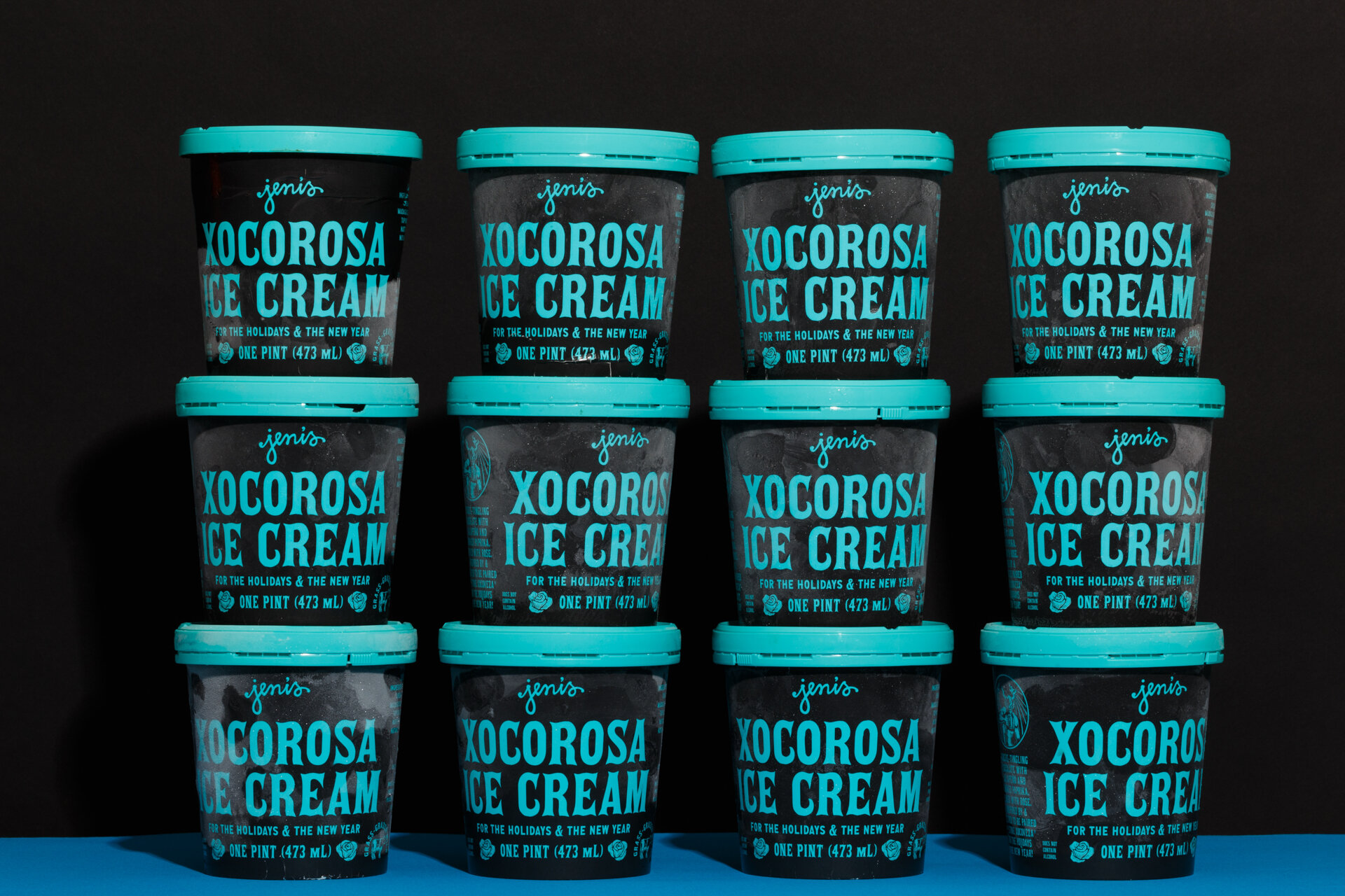
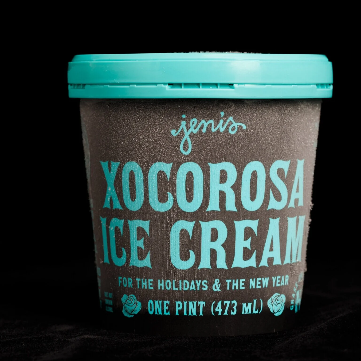
Pint designs for Jeni’s Splendid Ice Creams.
One of my favorite things over the last decade at Jeni’s has been the package design opportunities. From individual flavors to collections, each design is an artist’s representation of what’s inside. Flavor specific elements like handwritten ingredient panels and hand painted cinnamon rolls ensure that no two designs alike. Still actively art directing and designing, we continue to explore and push what is possible, while staying within the original layout I developed 3 years ago. Below is a curated selection of my favorite designs.
Photos by Erika Clark


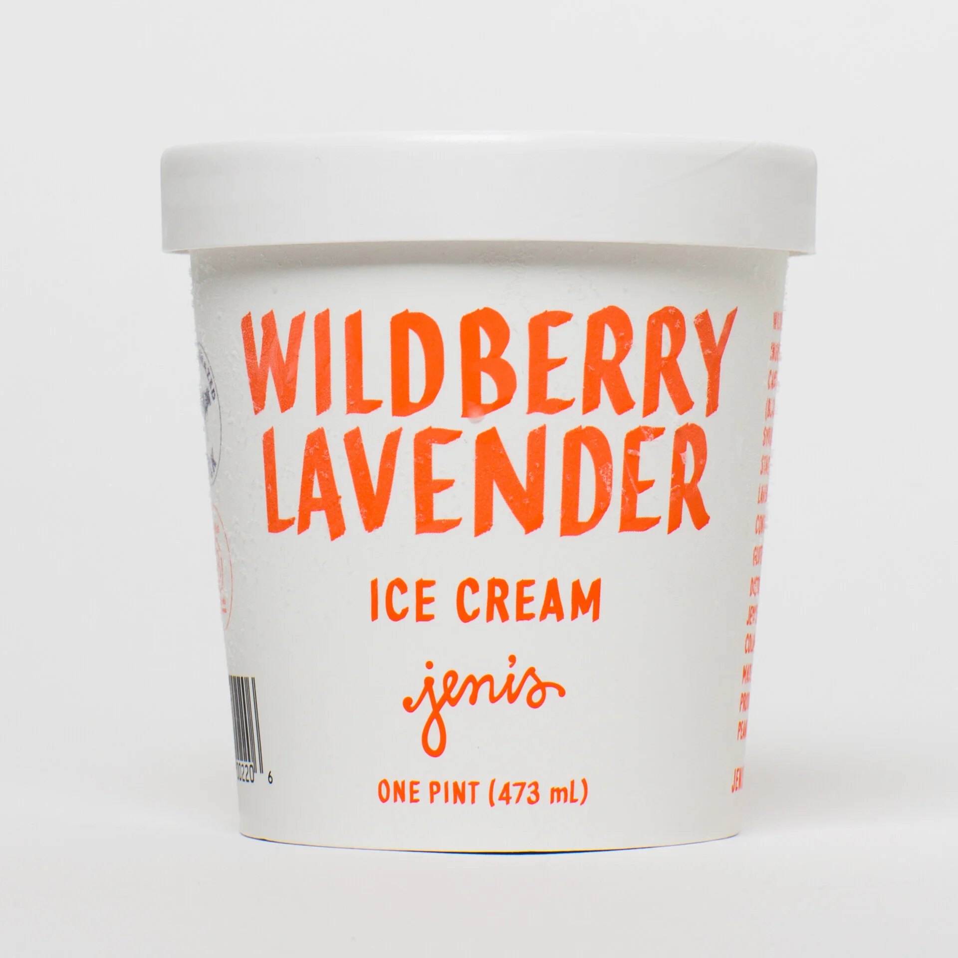
Wildberry Lavender
The new design pays homage to the flavors long history through the use of illustrations from Jeni's first book, Jeni’s Splendid Ice Creams at Home, handwriting on the front panel, and the fun and fruity color that’s distinct to Wildberry. I’ve always enjoyed designing pints for this flavor.
Photos by Erika Clark and Kelsey McClellan


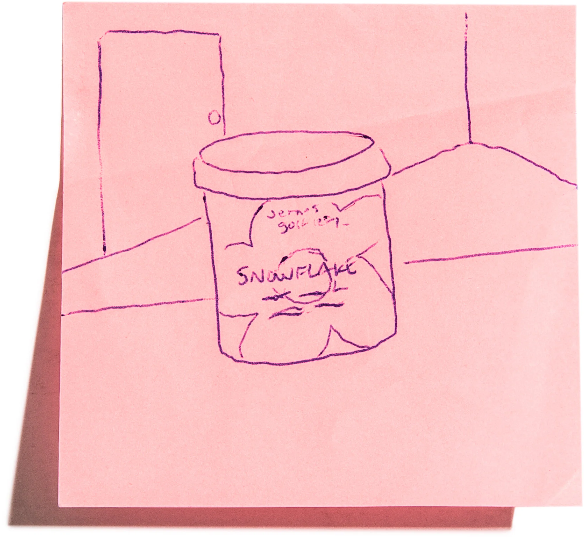
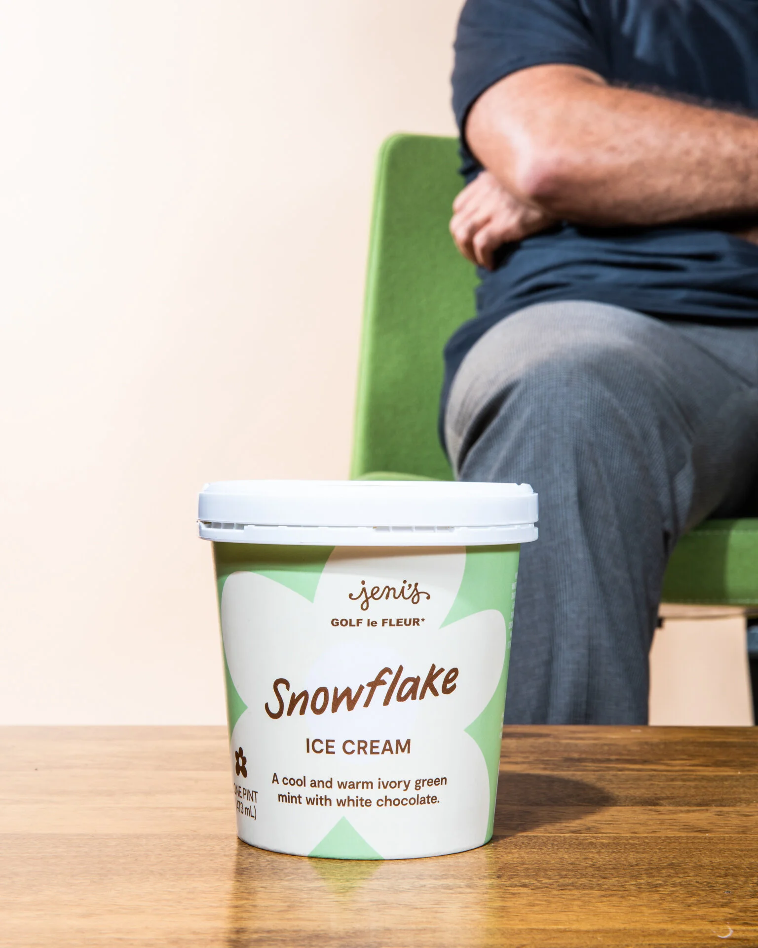
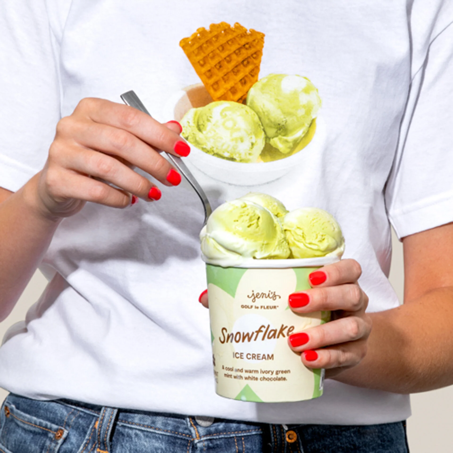
Jeni’s × Golf Le Fleur*
The packaging for Snowflake was designed in collaboration with Tyler, the Creator. He provided this Post-it note sketch for what he had imagined for this pint design. His team put together a preliminary design that was brought home by the Jeni’s Art + Design team.
Photos by Erika Clark


Claire’s Cabinet
This flavor was inspired by the show OUTLANDER. Jeni wanted the pint designed as if Jeni’s was a company in the 18th century, so direction was based off type setting and illustration styles seen in antique books of that time period.
Photos by Erika Clark


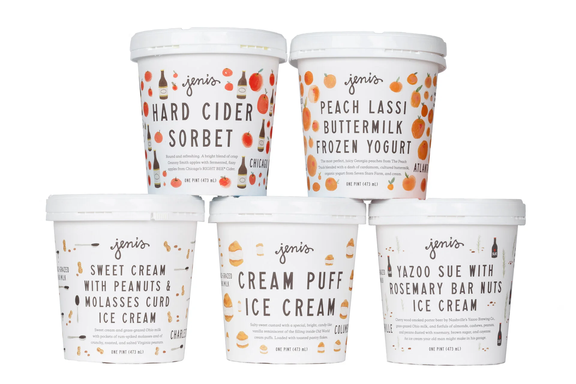
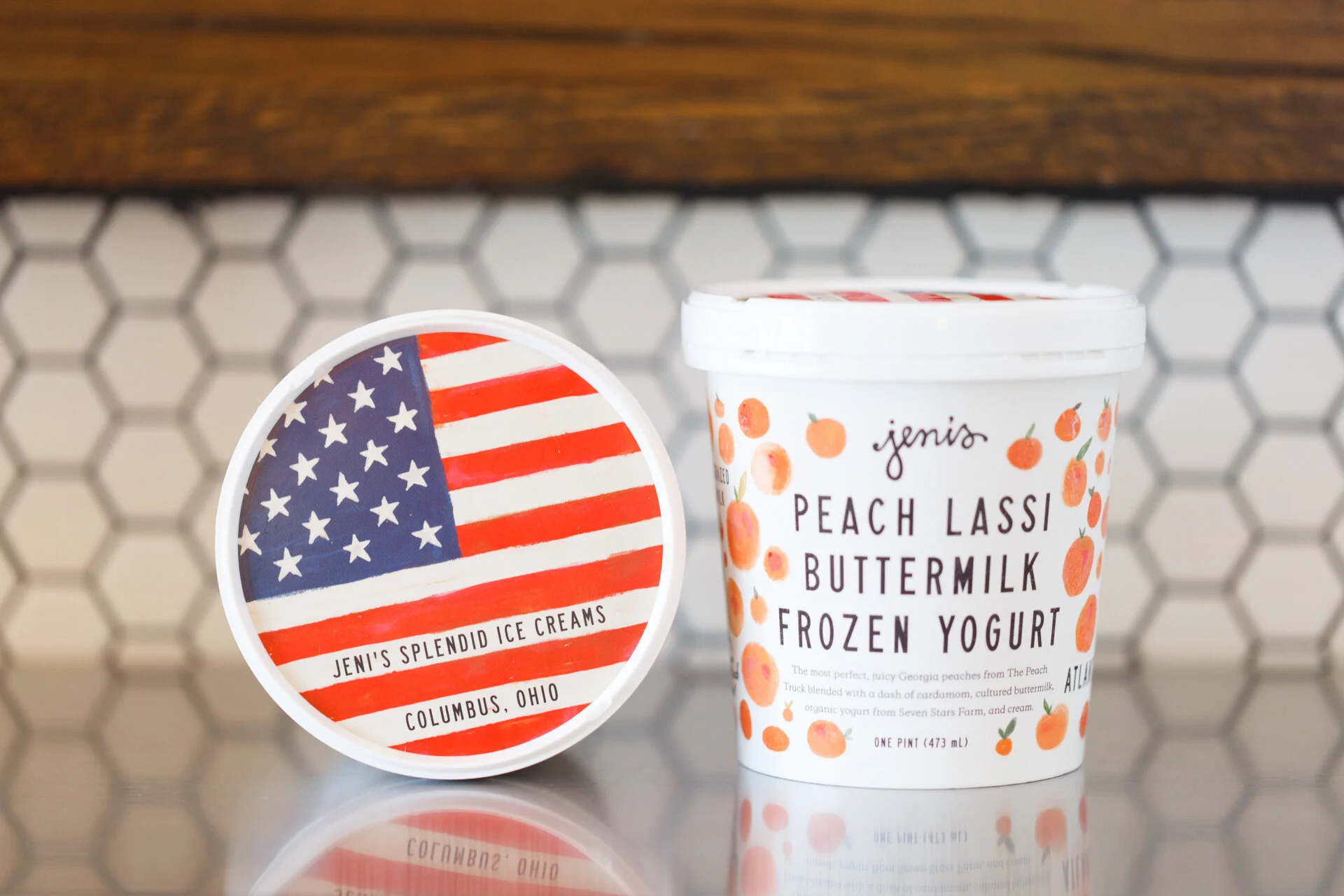
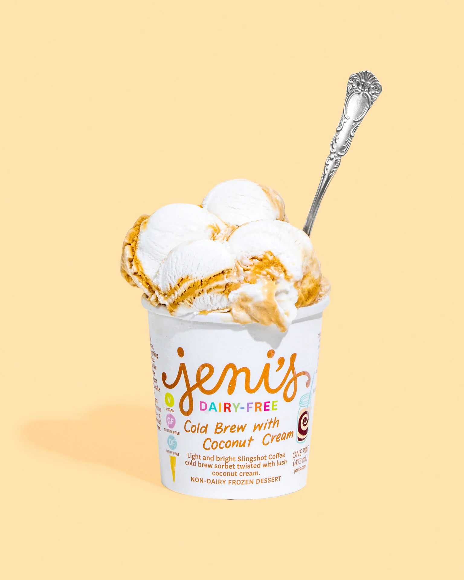
Dairy-Free Line
Lemon Bar and Caramel Pecan Sticky Buns were designed by Sadie Burzan.
Photos by Erika Clark


Splendid Holiday Line (2019)
White Chocolate Peppermint, Cognac with Gingerbread, Boozy Eggnog, Pumpkin Cake Roll, Sweet Potato with Torched Marshmallow.
Photos by Erika Clark


Strawberry Buttermilk
A flavor so special the Jeni’s team created an annual Festival around it. I’ve spent the 7 years making trips to local Ohio strawberry farms to shoot videos. This design is inspired by all of those times. The color pink leans slightly purple and the layout is adorned with dancing illustrations of strawberries. Evolution of this pint can be seen below.
Photos by Erika Clark


American Licks collection
Winter 2016
Art direction and design for this collection was based on mid-century American ice cream packaging, shops and books. I wanted to pair commonly used fonts of the era with with bright pops of color to bring them into the 20th century.
The collection was both a throwback (honoring the flavors we grew up with) and a nod to contemporary ice cream technologies (celebrating our ability to recreate moments that only ever existed in our memories). We set out to design classic ice cream flavors that taste exactly as you remember them, but better than they ever were. – Jeni
Photos by Nick Fancher